Monday, February 25, 2008

Stars Over Mid-Atlantic

Sunday, just as it became full dark and started to rain, I drove into the driveway home again in Beaufort NC. Five straight hours of driving on mostly two-lane country roads and those porch lights sure looked welcoming! This trip was to Hampton Roads, VA to teach at the Mid-Atlantic Quilt Festival. I went up last Tuesday, helped judge the Traditional Quilts category with Didi McElroy (www.thatperfectstitch.com ), and then taught for three days.

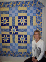
All my classes were full. Foundation Piecing Fabulous Stars started the week with a bang. Most of the Perpetual Motion star blocks students are shown pinned up on the board (see picture above). Jeanette Henry (right) made a beautiful star in batiks that matched her own pink and brown clothing color scheme and Yvonne (below left) was so pleased when she finally got her black-n-white block together that she did a little victory dance. The class applauded!

Monday, February 18, 2008

The Graduates of the Quilt Studio

My first quiltmaking class at the Quilt Studio is over and the students have gone home-I'm feeling a little sad! Each woman's quilt top, though the same pattern, looked quite different since their color choices were unique. What am I going to do on Wednesday afternoons now?

My own first quilt class was a disaster. It was 1972. We met in the backroom of a needlepoint shop and made four small patches--a pieced Pinwheel block, an applique something, a crazy-patch square, and then a plain square we were supposed to hand quilt in. During week #4, we each consulted with the teacher and she gave us suggestions for quilt projects we might do after the class. She looked at my work and then said, "Uh, Pepper, maybe you'd like to do something decorative for the home, something like this-" and pointed to a picture in a magazine of a Sun Bonnet Sue on a quilted toilet seat cover. ( I couldn't make this up, folks.) I didn't go back to the class for week #5--I am a quilt class drop-out. Here's a picture of the very tatty strange block, grease stains and all, that was the only product of that first class.
In comparison, my students were all brilliant. Madeline McCabe (aka the Mad Stitcher) is making a bright quilt for a deserving son.

Mary O'Neill, recently moved here from NY (notice the city scape shirt) just likes blue and yellow.


And finally Shirley Ellis, freshly retired, who has found a new hobby and finally un-boxed the sewing machine she got for Christmas. Well done, ladies! I am so proud of you!

Saturday, February 16, 2008

Further Along the Drunkard's Path

Several years ago I designed a line of prints called Jazz Age for Telegraph Road Studio. The head designer at the company, Beth Bruske, taught me a lot and I am grateful to her. When the company asked me to do a small graphic Jazz Age piece to hang in the TRS booth at a trade show, I naturally turned to my favorite pattern Drunkard's Path for inspiration. However when they saw the piece, the general reaction was "Not that graphic!" *sigh*

Don't go looking on the web for TRS. Last summer it was folded back into its parent company David Textiles so it doesn't exist as a separate entity anymore. While Jazz Age was adored by a few, putting it mildly, it was not an across the board hot-to-trot success. But I loved every one of the deco-inspired prints and am proud to have gotten that many strange and wonderful prints into cloth. Jazz Age came in both a blue-n-orange colorway and a purple-n-green colorway.
When Quilter's World magazine asked me to design a wall hanging in Jazz Age, I couldn't help it and reverted to another classic curved block called String of Pearls. You could have knocked me over with a feather when I found out my little piece titled Jazz Lover was the magazine's cover for February 2007! I think that they did a great job of showcasing the wall hanging in a ritzy Art Deco office setting. My one--and only--cover quilt.

Tuesday, February 12, 2008

The Path to True Love

Back in 1991 when I was writing a book on the Drunkard's Path pattern, I enjoyed fooling around with the elements of that pattern. Basically a DP unit is just a square divided into a quarter-circle and its wing-shaped remainder. I even made up some new block patterns and a few were good enough to actually make it into cloth. The book was named Happy Trails because I thought the word 'drunkard' might scare people off. It didn't of course and the book sold well. It's still in reprint with Dover Publications but now is called 65 Drunkard's Path Quilt Designs. Excuse me- (yawn) Dover is not known for being over-imaginative when it comes to titles.

Below is Prayer for the Animals, a little wall hanging I made using a Drunkard's Path variation from the book. The block is called Opening Valentines. I found the wonderful animal print at a decorator shop and carefully cut the triangles to give nice portraits of the animals. The printing was done with a Pigma pen and is from the old Anglican hymn that begins, "All things bright and beautiful, all creatures great and small-"

I hope you can spend Valentine's Day with someone you love. But just in case you're feeling bereft because an over-priced bouquet of roses didn't land on your doorstep, remember you can still celebrate V-Day by giving your animal friends some special attention. They're not as picky as humans and would love an extra pat on the head or a tummy rub. Or just donate your pocket change to the local Humane Society. Love comes in all shapes, sizes, and species. Happy Valentine's Day.


Monday, February 11, 2008

Speeding Toward Valentine's Day on the Chocolate Express

I am in love again. At the Chocolate Festival in Morehead City, NC, I met a brand of chocolate bar that is superb. Meet Escazu, a gourmet chocolate maker from my hometown of Beaufort, right next door to Morehead. The company's website is www.EscazuChocolates.com.

I can recount where, why, and when I've experienced great chocolate highs. But that was not always true. All through my childhood I was allergic to chocolate. After puberty however, it was "Katy bar the door-" when it came to the lovely bean. At first Hershey's Kisses were all I needed but I soon discovered the Mounds Bar, a dark chocolate candy bar filled with sweet coconut. Then Godiva (dark chocolate around raspberry filling), Ghiradelli squares of various flavors, and then the world-or at least Belgium. On a single memorable trip to Brussels, I sampled wonderful Leonidas Chocolates, which made me totally giddy, and the beautiful Guylian swirled chocolate seashells, which I bought simply because the tin was so beautiful. Along the way, there have been side trips to the Netherlands (hot dark chocolate from Droste) and England (those silly Cadbury's eggs at Easter).
Now my chocolate search has come full-circle and I discover there's great chocolate literally down the street. My favorite Escazu offering is the bar with crunchy roasted coffee beans but my husband's favorite is the Beaufort Bar, an intriguing dark chocolate spiced with sea salt. Tasting is believing.

Friday, February 8, 2008

Dye, Baby.


I found this wonderful old postcard on ebay ages ago and bought it because it was so characteristic of late Victorian manners. My friend Joan Kiplinger, who manages the list Vintage Fabrics, http://www.fabrics.net/joan.asp , confirms that the date of the card is likely late-1880s. We see a lady professor giving a class in "Economy." Her students are lined up like brightly-colored parrots and they listen attentively as she lectures them: Now, young ladies, you see how successful I have been with the DIAMOND DYES. In no other way can you so easily economize as by re-coloring faded or dingy articles by their use. That's a mouthful!

The teacher herself wears a dove gray dress but I suspect the shade has faded from mauve, the most popular color of the age. Notice that the items on the clothesline are all generic household cloths, with the the exception of the socks. Likely it would have offended Victorian sensibilities to show a dress, or, God forbid, a petticoat or bloomers on the line!

This card was designed to appeal to everybody: traditional women (the young girls are panting to be married-) and even the new up and coming "career woman," as represented by the teacher. But rather than just say, "Oh, go dye that old dress and have fun with it-" the blurb comes across in a rather Puritan tone. Read between the lines: You will be successful like me if you use these dyes. You will save money if you use these dyes. Then again: It's easy--(because you're obviously young and stupid!) and finally, No other thing you could do would have this great an effect.

A company couldn't get away with this hype today but in the late 1800s, overblown verbiage was common. What's ironic is that actually the whole dye industry was going bonkers at this time and producing lots of dyes that later changed color or faded completely! Congo Red, patented in 1885, faded to a sad shade of pink on cotton fabrics. And there's a green, called Fugitive Green now by textile scholars, that was an eye-popping yellow-green when it first came on the market but faded to a downright dismal khaki. You'll probably see it on ebay when a late 19th century applique quilt comes up for auction. The seller will write, " The color scheme is an unusual combination of red, beige, and yellow...." Ah, no. That quilt was red, green, and yellow when it was first made!