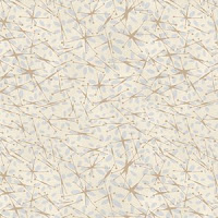
Here's hoping this February posting starts 2013 off right. After having been off-blog for a while, it feels somewhat awkward as I try to ease back into the habit of writing and posting. But I have big news and lots of visuals to share and that will make today's post a bit easier.
Water Striders sand+sage
Quick back story: last May I gave a lecture on color trends at the Spring Quilt Market, a wholesale trade show for the quilt/independent fabric stores. Afterwards a woman came up to the stage and we started to chat. She was Megan Downer, the new art director for StudioE fabrics StudioE and we 'clicked' as we got to know one another. I was encouraged as I got to know Megan and met Scott Fortunoff, the head of StudioE and thought, "These folks are real and they want to make beautiful fabrics." After some back-n-forth conversations, I signed with StudioE and Megan and I started work on a new fabric line. Off to plow through my documentaries (antique fabrics) for inspiration.
When it came to the fabric game, this wasn't my first rodeo. I had designed fabrics for Michael Miller from 2000-2003, then for Telegraph Road (a subset of David Fabrics) and lastly a line for Avlyn. But by 2012, my appetite for working in the fabric business was considerably diminished. The never-ending desire for new fabrics and new prints feeds the product end of the quilt market and it never ceases to amaze that a craft born of scraps and leftovers has spawned such a healthy international business. Signing on for this gig with StudioE means I'm ever an optimist and believe that quilting is a still-growing craft worldwide.
In designing this first group of fabrics, I didn't mean to do anything revolutionary--I just wanted to present a lovely quiet palette of prints that would inspire people to make quilts. Truly I wasn't even thinking of the commercial appeal but left that to the marketing gurus of the company. Personally I had gotten downright bored with jewel-tone, sock-em-in-the-eyes contrasting color schemes. Some of the booths at that Spring Quilt Market had looked bright as circus tents and just about as appealing. The taupe prints coming out of Japan however were calling me and so that's the spectrum I went to--colors that were decidedly neutral and greyed.
No more talking--you want to see the pictures! Meet Town and Country, a new fabric line by moi and the geniuses at StudioE who make my ideas real.
I've been asked about the name of the line-- Town and Country. All that means is that print inspirations came both from nature and from man-made objects. Two of the graphics derived from natural scenes--a mod take on those little insects called water striders that you might see frolicking on a quiet pond. The gold Water Striders are the image found at the opening of this blog post. Two more graphics were man-made: diagonal brush strokes and an overall interpretation of fishing net. The last print was a synthesis--regularly-spaced dots that brought together all the colors in the line.
 Water Striders
Medium charcoal with brown
Plum with rust
Oyster with sand
Paprika with rust red
Mum
Charcoal

Oyster

Walnut
Charcoal
The man-made image is Brush Strokes. Think paint being brushed with a nearly dry brush on a wall diagonally.
Sage
Oyster
Paprika
Sand
Netting
Fog Grey
Netting is another man-made concept. Imagine a fishing net sprawled over a parchment-like background.
Plum
Oyster
Dots keep it all together.
Walnut


Charcoal
Sand

Light Sage
The intrepid sales representatives for StudioE, those road-warriors of the fabric business who travel and sell shop-to-shop, got their sales cards of Town and Country last month and right now they're taking orders as they show the cards to store owners. If you are a store or interested in your store ordering these fabrics, feel free to recommend this blog to the store owner. By May, the next Spring Quilt Market, the fabric will be real as it rolls out of the mills and most stores will start getting their orders in August, just in time for the 2013 cold weather and quilting season. I know that quilting isn't seasonal for those of us who are quilt fanatics but a lot of folks can't envision working on a quilt until it turns cold and Christmas is looming.


11 comments:
I can't wait to see the water striders on the shelf. They will come to my studio for certain.
I really like the neutrality of your colors --- look forward to seeing them in the quilt shops!...and, hello from Lansing, where it is cold! which it is supposed to be in February!
What a beautiful line of fabric Pepper. Congratulations.... Bravo!
Love your new line of fabric. I especially like the brush strokes. Can't wait to see it in LQS.
Love, love, love your new line. I look forward to seeing & using it.
Phyllis
Such great fabric and I love the name 'Town and Country' - hope the range does really well
The fabric looks yummy! I too am tired of the bright / high contrast look that seems to be everywhere. Prefer to play with more subtle fabrics. Thank you!
Love these fabrics!!!
Your calm, peaceful, yet interesting and beautiful color and print fabrics are wonderful, natural impressions. And yes, it is a relief to find such thoughtful, welcoming values and texture in fabrics that do not shock the spirit and turn the stomach. You have accomplished great designing, thank you.
Love the subtle colors... cannot wait to see them in person!
Love your colors, and the dots are wonderful! Just my style!
Judy Sturm
Post a Comment